 Early Lessons in Color
One of my earliest childhood memories is sitting at the kitchen table with my mum, surrounded by tubes of watercolor paint, a jar of brushes, and sheets of white paper. She taught me how to mix paints to create different colors. It seemed magical. I learned that red and blue make purple, blue and yellow make green, yellow and red make orange, and so on. More than anything, I enjoyed that special time with her doing something we both loved. Those afternoons almost certainly influenced my later decision to attend art college.
Seeing Color Differently
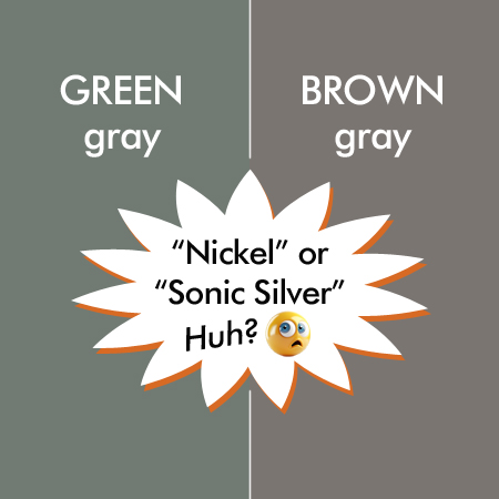
In a color theory class at college, no one mentioned how difficult it is to describe hues, tones, and shades to another person. It didn’t occur to me that people perceive colors differently until I bought a cardigan I would call greenish taupe, similar to the left side of my graphic. Some friends thought the sweater was brown, while one said it was gray. The colors had the exact same saturation and brightness values, so the differing opinions made sense. An online app called the right-hand brownish color “Sonic Silver” and the greenish one “Nickel.” Neither name was helpful.
Not a big deal, right? Wrong. When it comes to matching home décor with existing paint colors, these subtle differences matter a lot.
The Online Shopping Advantage, and the Problem
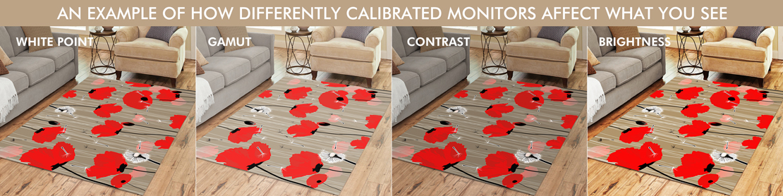
Shopping online has obvious advantages: it’s fast, the options are endless, and you can browse from the comfort of your home. But there’s a hidden challenge. Computer monitors and phone screens are calibrated differently, which means what you see online might not match what arrives at your door. Ideally, everyone would use the same calibration standard, but that rarely happens. This inconsistency is especially troublesome for home décor textiles.
Why Calibration Matters
Standard calibration tools that come with Windows or Mac, or even online software, won’t give you reliable results. They depend on your eyes, and eyes are subjective. For objective accuracy, you need a colorimeter. This small device attaches to your screen and works with calibration software to optimize display color based on your monitor and room lighting. I bought one on Amazon for about $230. It wasn’t cheap, but if you work with color professionally, it’s an essential investment.
Printed Color vs. Screen Color
Printed colors will almost always look less saturated than what you see on a screen. On a monitor or phone, you’re viewing colors illuminated by a light source, which makes them appear more vivid. On fabric, however, you see colors reflected by surrounding light, which makes them appear softer and more subdued.
Sublimation Printing and Fabric Differences
It’s also important to understand the limitations of sublimation printing, which is the process used for my products. I’ve learned which colors to avoid and which to adjust depending on the fabric. Polyester fabrics like shower curtains, rugs, and bedding sets print brighter, while cotton blends such as table linens produce a more muted, vintage look.
A Note to My Customers
I always encourage customers to reach out with questions about color matching. If I don’t know the answer, I’ll consult the professionals who print my items so you can make the most confident choice possible.